Gallery Wall Ideas: Layouts for Every Room
Gallery wall ideas with layouts for living rooms, bedrooms, stairs and small spaces, plus the spacing rules and hanging steps that make them work.

By Julio Arco
Architect and online interior designer

In this post
A good gallery wall comes down to three decisions: pick one layout (a grid or an organic cluster), keep the spacing between frames consistent, and tie everything together with one repeated element such as frame color, mat color or subject matter. Do those three things and almost any mix of art and photos will look intentional.
Below are the main layouts, ideas by room, and a plain hanging method. If your wall is a bit blank and you aren't sure where to start, that's very common, and it's easy to fix with paper templates and some painter's tape.

Which gallery wall layout should you choose?
Most gallery wall layout ideas fall into two families. Pick based on how formal you want the wall to feel and how uniform your frames are.
Grid layouts
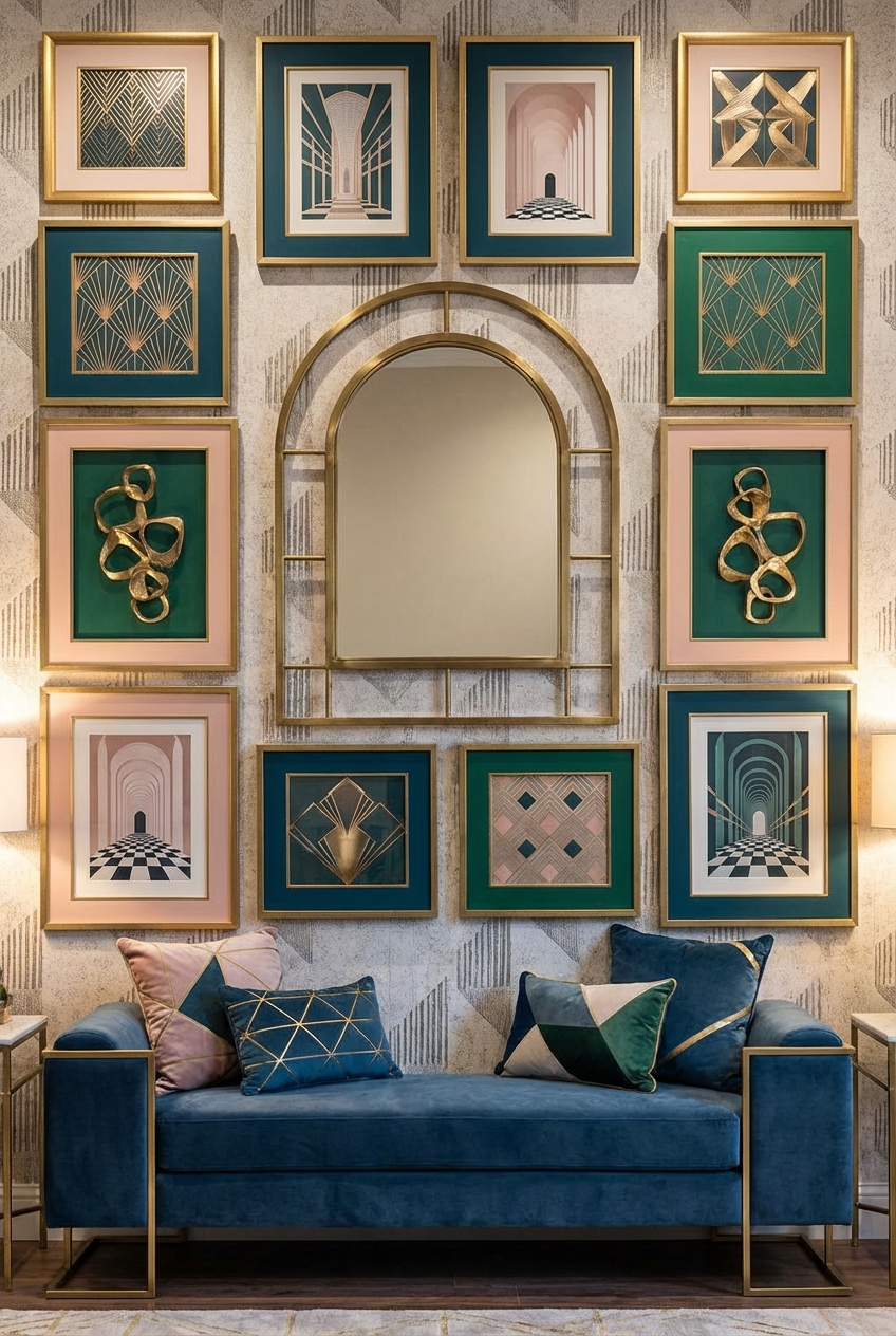
A grid uses frames of the same or similar size, aligned in rows and columns with equal gaps. It reads as calm and ordered, which suits a hallway, a dining room or a bedroom wall. It relies on symmetry, and Cornell's Principles of Design describes symmetrical balance as equal "weight" on equal sides of a centrally placed fulcrum. In practice: if the left and right halves of your grid match, the wall feels steady.
Organic layouts
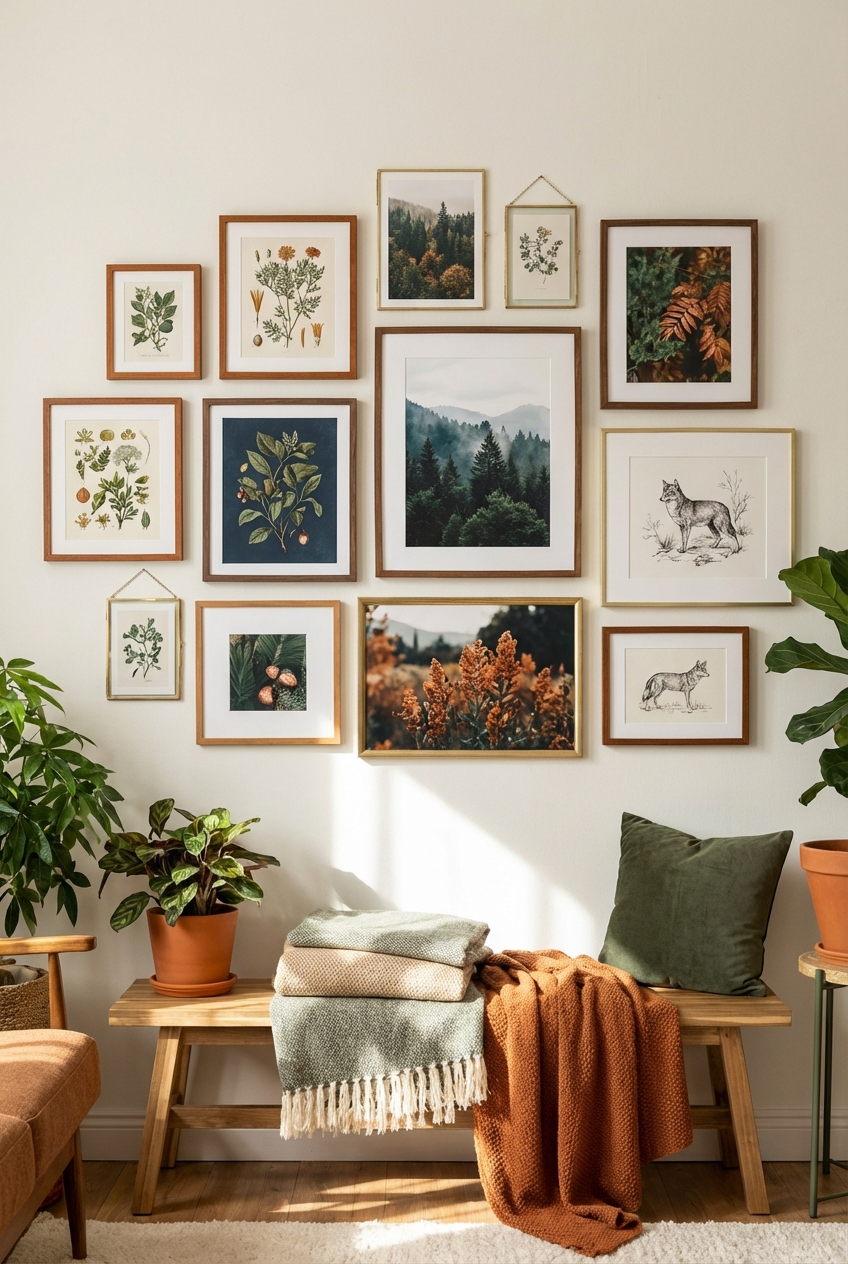
An organic layout mixes sizes and orientations in a loose cluster. It's more forgiving, since you can add a piece later without breaking a pattern. The trick is to keep the outer edge roughly rectangular or oval and to keep the gaps between frames about the same, even when the frames differ.
Mixing vertical and horizontal pieces
Put the largest piece slightly off center, then balance it with two or three smaller frames on the opposite side. Alternate tall and wide frames so the eye moves across the wall instead of stacking in one column.
How do you plan the spacing and size?
As an architect, I'd treat the whole arrangement as one large object. Here are the proportions I recommend as a starting point:
- Leave about 2-3 inches between frames. Pick one number and hold it everywhere.
- Over a sofa or console, keep the group at about two-thirds to three-quarters of the furniture's width, and hang the bottom edge roughly 6-10 inches above it.
- Center the group at about 57-60 inches from the floor, around eye level, when the wall has no furniture below.
Cornell's Charlotte Jirousek writes, "Our most universal standard of measurement is the human body; that is, our experience of living in our own bodies." (Principles of Design). That's the reason eye level matters more than the exact center of the wall.
Gallery wall ideas by room
Gallery wall ideas for a living room
Above the sofa is the classic spot. Keep the group narrower than the sofa and use a shared frame finish so a mix of prints, photos and a small mirror still feels like one piece. If you have a dog who sheds on the sofa and shakes against the wall, hang the lowest frames a little higher and skip glass-fronted art right at tail height.

Gallery wall ideas for a bedroom
Over the headboard, a grid or two rows of matching frames keeps things restful. Choose softer, lower-contrast art here, and anchor the group to the width of the bed so it doesn't float. If you like a more personal look, a gallery wall bedroom setup works well with family photos in matching black-and-white prints.
Gallery wall ideas for a small space
In a small room, go vertical. A tall, narrow column of frames beside a door or window draws the eye up. Use light mats and thin frames, and keep the number of pieces low. A single mirror in the group bounces light around, which helps a compact room feel less boxed in.
Gallery wall ideas for stairs
Stairs call for a staggered layout that follows the slope. Keep the center of each frame a consistent distance above the stair nosing line, and step the frames up parallel to the rail. Use lightweight frames, hang them securely and leave enough room that nobody brushes them while carrying laundry or walking a dog up and down.

How do you make a gallery wall interesting?
Variety within limits. Mix a few of these:
- Different frame depths, so some pieces sit forward.
- A mirror or a small shelf in the group, which adds a break in the rhythm of flat art.
- Textures such as a woven piece or a thin wooden object next to prints.
- One oversized piece as an anchor, with smaller ones around it.
Then repeat something. One frame color, one mat width or one color in the art is enough to keep it cohesive.
Vintage gallery wall ideas
For a vintage gallery wall, gather mismatched antique frames, botanical prints, old maps and small oil paintings. Unify them with a coat of the same paint on the frames, or keep the mats consistently off-white. Thrifted frames are fine as long as the glass is clean and the hanging hardware is solid.
How do you hang a gallery wall without regret?
- Trace each frame on kraft paper and cut out the shapes.
- Tape the paper templates to the wall and move them until the layout looks right from across the room.
- Mark the hanging point on each template, then hammer the nail right through the paper.
- Tear the paper away and hang the frame.
Start with the anchor piece, then work outward. If you rent, use picture-hanging strips rated for the weight of each frame, and check the package limits. For a very heavy mirror, find a stud or use proper wall anchors.
If you want to go further with walls, the wood paneling post shows a textured backdrop that suits gallery walls, and the black accent wall guide covers a dark background that makes light frames stand out. For tight rooms, see these small bedroom ideas.
Frequently asked questions
What is the rule for gallery walls?
Keep the gaps between frames consistent, usually about 2-3 inches, and center the group around eye level. Plan the layout on paper or the floor first.
Are gallery walls still in style?
Yes. They remain a common way to show personal art and photos, and the style adapts easily from minimal grids to eclectic clusters.
How to make a gallery wall interesting?
Mix frame depths, add a mirror or small shelf, and vary the scale of the pieces. Repeat one element, such as frame color, so the variety still looks planned.
Should a gallery wall be centered on the wall or on the furniture?
Center it on the furniture below it, such as a sofa or bed, so the two read as one unit. On an empty wall, center it at eye level.
Filed under
ArticlesMeet the author
Written by an architect.
Julio Arco is a passionate architect with years of experience in architecture, interior design, urban design, and housing. He studied at prestigious universities across North America and Europe.

- Name
- Julio Arco
- Job
- Architect and online interior designer
- Studied
- Architecture, ITESM · Urban Design and Housing, McGill
- Partner
- Thor, Australian Shepherd
- Thor’s title
- Head of quality control