
Bringing Vibrant Life to Your Spaces with Color Theory

Like what you see? Check out my Portfolio & work with me or any Havenly designer, & spruce up your home with Havenly, the platform that has revolutionized online interior design since 2013! Offering online interior design services & home decor from the best online interior designers at an affordable price! Take 25% off your first design TODAY!
Psychology of Color in Interior Design – Introduction Video
Colors have the power to transform our spaces and affect our moods and emotions in countless ways. According to research about color theory by Research Gate in the article titled “Effects of Color in Interior Design,” the colors we choose for our homes can uplift or depress us. Our culture, experiences, and memories greatly influence our perception of color.
In this article, we will explore the concept of evidence-based design in architecture and interior design, which uses objective research and data to inform decision-making. By applying environmental psychology theories and studying the latest environmental psychology topics and studies, we can create spaces that look good and promote health and well-being.
Bringing Vibrant Life to Your Spaces with Color
Colors can also affect our time perception, with warm and vivid color schemes speeding up time and neutral and plain ones slowing it down. An article published by NCBI found that blue interiors were the most preferred, followed by green, violet, orange, yellow, and red. A preference bias was found for the specific color the student lived in, and gender differences emerged for the preference of blue and violet.
The interior color significantly affected the room’s lightness, and the room ceiling was preferred to white. Blue as an interior color was considered to facilitate studying activity. According to an article published by Sage Journals, warm colors tend to produce stronger participant responses when rating the scene on “high arousal,” “exciting,” and “stimulating.” Cool colors tend to be associated with “not very arousing.”
By understanding the psychological effects of color, we can also use it to help us choose furniture such as chairs, sofas, coffee tables, rugs, fabrics, and other furniture.
1.- White – “The color of purity and simplicity.”
White is a timeless color that is often used in interior design for its clean and fresh appearance. The color of purity and simplicity, white evokes feelings of cleanliness and openness.
It’s often used as a base color in interior design, creating a blank canvas for adding other colors and decor. White can make a room feel larger and more open, making it a great choice for small spaces.
It’s also a popular choice for walls, ceilings, and trim, as it helps to reflect light and create a bright and airy atmosphere. Color plays a significant role in interior design and can greatly impact a space’s overall feel and mood.
The psychology of color in interior design is based on the idea that different colors can evoke different emotions and feelings in people. The color wheel in interior design is a useful tool to help understand how colors can be combined to create a cohesive and pleasing design.
Therefore, white is a perfect base for adding other colors and decorative items. It provides a bright backdrop that can be paired with bolder tones to create visual interest and softer hues like pastels or neutrals to create an inviting atmosphere.

2.- Beige – “The color of warmth and neutrality.”
Beige is a versatile color that can be used in a variety of interior design styles, from traditional to contemporary. As a neutral color, it can be paired with other colors to create a color palette that is cohesive and balanced. The psychology of color in interior design plays a crucial role in how a space is perceived, and beige can be used to create a sense of calm and relaxation.
When using beige in interior design, it’s important to consider the color wheel and color theory. Beige is warm and can be paired with cool colors like blue or green to create contrast and balance. Color harmony in interior design is important to create a visually pleasing space, and beige can be used as a neutral base to complement other colors in a room.
Additionally, matching rugs, layering rugs, and choosing the right size rug can also enhance the look and feel of a room when using beige as the base color.
It is also important to consider factors such as flooring and window treatments when decorating with beige and to remember that beige can be used in various ways to create different effects depending on the style and ambiance you want to achieve in a room.

3.- Gray – “The color of elegance and sophistication.”
Because of its beautiful and refined look, gray is a popular color choice in residential areas. It generates emotions of peace and stability, making it an excellent option for rooms intended for leisure, such as a home office or study.
Gray is also a good color for walls and floors since it helps create a unified design and can be matched with various colors. It’s also an excellent choice for harmonizing furniture, such as an L-shaped couch or arranging two sofas.
By understanding the link between colors and how they might affect one’s emotions and behavior, the color wheel and color theory in interior design play an important part in the psychology of color in interior design.
Gray in interior design may also be used in conjunction with other colors to create balance and harmony in the space, according to color psychology concepts in interior design. Adult daybeds and a corner chair in gray may also be used to give elegance and refinement to the space.

4.- Blue – “The color of serenity and tranquility.”
Blue is a common option for home settings since it is a cool and peaceful hue. It may elicit emotions of calm and tranquillity, making it an excellent option for bedrooms, living rooms, and home offices. Blue, in lighter colors, may also assist in making a space seem more open and spacious.
In terms of color theory, blue is on the cold side of the color wheel, making it an excellent option for relaxing areas. Color psychology in interior design is very important in establishing the ideal ambiance in a space.
Blue, being a relaxing hue, is an excellent option for creating a feeling of serenity and tranquillity. Furthermore, when combined with other colors correctly, it may assist in creating a feeling of harmony and balance in a place. Understanding the significance of color in interior design and how to apply it successfully may significantly improve a room’s overall appeal.

5.- Green – “The color of nature and balance.”
Because of its link to nature and capacity to generate a feeling of harmony, green is a popular color choice in residential areas. It generates sensations of development, harmony, and tranquillity, making it an excellent option for relaxing environments.
Green is also a popular color for bedrooms since it promotes a feeling of calm and comfortable sleep. It may also make a space seem more open and breezy when utilized in lighter tones. Green may also be included in your home design via the usage of plants.
When placing plants, keep in mind the size and form of the space, as well as the quantity of natural light it gets. Avoid making typical blunders like planting plants in low-light regions or not giving adequate water or humidity for the individual plant.
Before introducing a plant into your house, you should also be aware of plant toxicity and investigate any possible concerns. To keep your houseplant healthy and growing, be sure to offer the proper care, including selecting the best location for your plant based on sunlight levels, utilizing a moisture meter, and supplying the optimum humidity.
Hanging plants and pet-friendly indoor trees may bring a distinctive touch to your interior decor and are particularly ideal for pet-friendly households. There are numerous inexpensive alternatives and trendy houseplant types to pick from, making it simple to choose the appropriate plants to add to your home.

6.- Yellow – “The color of cheer and optimism.”
Yellow is a color that is commonly used in interior design to create a sense of cheerfulness and optimism. It is often used in residential spaces such as kitchens and living rooms as it can create a warm and inviting atmosphere.
The psychology of color in interior design plays a significant role in how yellow is used, as it can evoke feelings of happiness and positivity. In color theory, yellow is considered a warm and energizing color, making it a great choice for spaces that are meant to be used for relaxation and socializing.
When used in lighter shades, it can also make a room feel more open and airy. The importance of color in interior design cannot be overstated, and understanding how to use yellow in a space can greatly impact a room’s overall look and feel.
The role of yellow in interior design is to create a desired mood and atmosphere and to emphasize certain elements of the room. The use of yellow in interior design should be balanced and harmonious to achieve a cohesive and visually appealing space.

7.- Orange – “The color of warmth and energy.”
As an interior designer, understanding the psychology of color is essential when creating a space that both looks and feels great. For centuries, orange has been used in design, as its boldness and vibrance can evoke positive emotions. Depending on how it’s used, orange can create a sense of warmth and energy or an airy atmosphere of relaxation.
When using orange in interior design, it’s important to strike a balance between the tone of color and the function of the room. Too much orange can cause a feeling of intensity, while too little will be dull and lackluster.
Different shades of orange must also be taken into consideration when creating a harmonious look. Whether you incorporate bright tangerines or more subdued salmons, mixing different hues adds depth to any room.
With careful consideration of the psychology behind color, understanding how to use orange correctly can make for beautiful and inviting spaces with its unique combination of vibrancy and warmth.

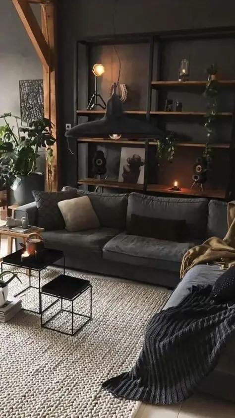
8.- Black – The Color of Mystery and Sophistication
Black is a timeless choice for interior design that has been used for centuries to create atmosphere and drama. When combined with other colors, black can help to define and emphasize a particular space, drawing attention to its boldness. Its striking nature can easily become the focal point of any room or even an entire house.
Black can be used in different ways to help achieve different effects. It pairs well with neutrals like whites and taupes to create a clean and modern look, while bright punches of color like reds or greens make it appear more vibrant and vivid. Combining black with softer shades like blues or purples provides a contrast for delicate touches and makes the space feel calmer.
Textures such as glossy finishes or matte surfaces can add depth and dimension to your space without overwhelming the eye. With so many possibilities, understanding how to use this versatile color is key to creating spaces that are both classic and sophisticated yet edgy at the same time.
9.- Violet – The Color of Creativity and Imagination
The color violet is symbolic of ingenuity and originality. This color’s mysterious and calming effects make it a favorite for use in bedrooms, meditation areas, and even businesses. A splash of purple on an accent wall or in a piece of artwork may also create a dramatic design statement. The psychology of colors is a crucial factor in the design of interior spaces.
You may provide contrast, which in turn contributes to visual intrigue and inventive features, by combining matte and glossy surfaces or by combining various shades of the violet color. Taking use of this inventive color’s many applications is crucial to creating a space that is both stimulating to the mind and relaxing to the senses.

10.- Pink – The Color of Romance and Femininity
Pink is the color of romance and femininity. Its soft, romantic hues evoke feelings of warmth and tenderness, making it a popular choice for bedrooms and bathrooms. Its association with femininity allows it to also be used in children’s rooms and play rooms to create a playful atmosphere. In interior design, pink can also be used in more muted or pale shades to bring an air of sophistication and elegance to any space.
Understanding the psychology of colors in interior design is essential in creating the desired feel of a room. The color wheel helps identify which colors work together harmoniously, while color theory gives insight into how different hues interact with each other. Knowing the importance of color, its role in creating atmosphere, and the principle of color harmony in interior design are all vital components for crafting an inviting environment that resonates with people’s emotions and feelings.

Color Theory – FAQ
What is the psychological effect of different colors in interior design?
Colors can tremendously affect our moods, emotions, and overall well-being. Understanding the fundamentals of the psychology of color can help us select paint colors for our houses that will help us feel at ease, comfortable, and happy.
Using principles of color theory, you can choose paint for your walls that will complement one another and make you feel comfortable. Designers can utilize the color wheel to establish harmonious color schemes and identify primary, secondary, and tertiary hues.
How can color theory be used in interior design to create inviting atmospheres?
Interior designers can use color theory as a powerful tool for making any space feel warm and welcoming. Selecting colors that work well together and create a relaxing ambiance can be done by consulting the color wheel, a graphic representation of the interactions between various hues.
Example: using complementary hues, which are those directly across from one another on the color wheel, to create a high-contrast, eye-catching effect. Designers can make a color scheme that serves its purpose while also being aesthetically beautiful by blending primary, secondary, and tertiary hues.
Designers can utilize color psychology in addition to the color wheel to choose the best palette for each space. Color theory suggests that certain hues have certain effects in specific settings; for instance, blue is commonly used in bedrooms to promote relaxation and better sleep, while red and orange are commonly used in living rooms to create a friendly and inviting ambiance.
What is the importance of considering objective research in interior design projects?
In order to make decisions in interior design projects based on data rather than subjective tastes or preconceptions, objective research is essential.
Considering current research in environmental psychology, architects and interior designers may build places that are good for people and cater to their needs. Certain colors and lighting conditions, for instance, have been demonstrated to encourage healthier sleep patterns, while others have been shown to have a negative impact on mental health and well-being.
Objective research can also help designers make educated judgments about the materials and furnishings utilized in a room. Some flooring materials, for instance, may release pollutants into the air that are detrimental to human health, while others may be more long-lasting and need less upkeep.
What are some of the best colors for a living room to create a warm and comforting atmosphere?
Neutral tones, like tans or greyish whites, and warm shades, like reds, oranges, or yellows, are some of the best colors for a living room to create a warm and comforting ambiance.
The use of neutral colors can create a relaxing atmosphere without becoming overpowering. Instead, a lively yet reassuring atmosphere can be created with the help of warmer tones, which can provide visual interest without dominating it. If your living room has hardwood flooring, you may also make them appear beautiful by adding accessories in earthy browns or natural wood.
How can accent pieces be used in a dining room to set up a calming ambiance?
There are a variety of ways that accent items can be employed to create a relaxing atmosphere in a dining area. For instance, combining metallic elements like varied metals to elegantly capture light with statement pieces can produce an intriguing yet serene atmosphere.
Fixtures with dimmers allow you to tailor the illumination to your specific needs. Add some life to the room with some potted plants to further improve the relaxing atmosphere.
Why are cool blues and purples considered the best bedroom colors for promoting better sleep patterns?
Cool blues and purples are considered the best bedroom colors for promoting better sleep patterns due to their calming effect. Studies by NCBI and Sage Journals have shown that these shades promote better sleep patterns, making them ideal for a relaxing and comfortable sleeping environment.
How can furniture pieces impact our well-being according to their color?
There are a few different ways in which the color of our furniture might affect our mood. For instance, “high arousal” feelings are more strongly associated with warm colors, while “low arousal” feelings are more closely associated with cool colors.
The color blue, in particular, is said to aid attention, making it a good choice for studying or other similar endeavors. To furnish a space in a way that encourages health and well-being, it’s crucial to take into account the aforementioned criteria.
What role do primary colors play in color combinations for interior design?
Primary colors are essential when putting together a palette for an interior design project. Primary colors are the foundation upon which secondary and tertiary hues are built, and they can stand on their own as striking, effective color palettes.
Primary colors are the building blocks of all other colors, so by combining them, you can make an infinite number of color combinations that are unique to your taste and improve the aesthetic appeal of your home.
How can two-tone paint combinations be used in a bedroom to reflect personal styles?
Two-tone paint selections in the bedroom can express individual tastes and styles by contrasting brighter and darker tones within the same color family. The use of two properly selected colors allows for the creation of subtle gradients that effectively convey the unique tastes of the room’s inhabitants.
A two-tone paint scheme can be used to create a soothing and pleasant resting environment by balancing the warm and cool tones in the room.
How can the use of complementary colors enhance interior design projects?
Color schemes that make a strong visual impact while being easy on the eyes can be achieved using complementary colors in interior design projects. Colors that are complementary to one another found directly across from one another on the color wheel work well together.
This can give a space more personality and charm by giving the impression of greater depth and dimension. Using contrasting colors to highlight one feature can also assist in making that feature the showpiece of a room.


Hire an Online Interior Designer at Havenly
There are several online interior design websites, but Havenly is your best option to hire from a robust list of interior designers that will help you in decorating and creating the perfect dog-friendly home.
When you sign up for Havenly, you will take a short quiz about your design style and what you are looking for in a designer. Havenly will then match you with a designer who will help you select paint colors, furniture, and accessories that are both stylish and safe for your furry friend.
In addition, your Havenly designer will be able to provide tips on how to create a space that is both comfortable for your dog and inviting for guests. With Havenly, creating a beautiful and functional home that your dog will love is easy and stress-free.
Click here if you want to learn more about Havenly or book an interior designer and get 25% off your design package if you click here!


